In the world of design, fashion, and branding, champagne and gold stand out. These metallic hues come in many shades. They range from subtle to flashy. They’re loved by both creators and buyers. The fame of rose gold and gold undertones is growing. So, it’s key to understand the difference between champagne and gold.
We’ll look closely at champagne color. We will uncover its versatility and effects. We’ll talk about its feelings and thoughts it brings. We’ll also show how it’s similar to beige and gold, yet unique. By the end, you’ll understand champagne’s beauty. Plus, you’ll know how to use it in your designs to grab attention and connect with your audience.
Key Takeaways
- Champagne color is connected to luxury, sophistication, and celebrations in high-end design.
- Champagne is a flexible neutral. It mixes well with various colors for different effects.
- It implies warmth, comfort, hope, and success. That’s why it’s common in lifestyle designs.
- Champagne is key for adding luxury and timeless touch to projects. This is true for branding and web design.
- It brings out positive feelings of joy and hope. That makes it perfect for uplifting designs.
What is the Color Champagne?
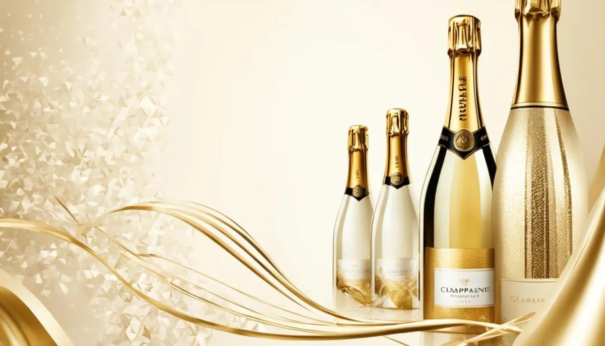
Champagne is a pale, yellowish-beige color with warm undertones. It gets its name from the sparkling wine made in France’s Champagne region. This color is often linked with luxury, celebration, and class. It can vary from pale gold to light beige, maybe with a hint of pink or peach. The shade changes based on light, texture, and nearby colors.
Champagne – A Pale, Yellowish-Beige Hue
Champagne is elegant and versatile, fitting many design needs. It’s a light yellow-beige with warm undertones, hinting at luxury. This color might show a pale gold, light beige, or even a subtly pink or peachy color. It all depends on lighting and surrounding tones.
The Origin of the Name “Champagne Color”
The term “champagne color” comes from the sparkling wine in France. This wine is known for its pale to light gold color, symbolizing luxury. Thus, the color has been widely used to signify sophistication in design, fashion, and brandings.
Variations in Champagne Color Shades
Usually, champagne is a light, yellow-beige. Yet, its shade can change based on light and surroundings. You might see hints of pink or peach, or a cooler silver look. These slight variations impact the mood and look in designs and branding, much like the effect of sparkling body adornments.
The Difference Between Champagne and Beige or Gold
Champagne and beige are both neutral but with different tones and warmth. Beige comes from mixing gray and yellow or orange. It looks like a light brown without champagne’s gold and yellow tints. Beige might also be cooler or warmer, based on the mix. In contrast, champagne is a soft beige with hints of yellow or gold. This makes it feel warmer and more upscale.
Champagne vs Beige: Undertones and Warmth
Champagne and gold share warmth and come from metallic inspiration. But, they show a different intensity and shine. Gold, a bright yellow, reflects a lot, standing out with its intense shine. Champagne is more understated. It’s a soft hue that looks elegant and sophisticated without screaming for attention.
Champagne vs Gold: Intensity and Reflectivity
| Characteristic | Champagne | Gold |
|---|---|---|
| Hue | Pale, yellowish-beige | Bright, metallic yellow |
| Undertones | Subtle yellow or gold | Strong metallic undertones |
| Intensity | Muted and subdued | Vibrant and intense |
| Reflectivity | Soft and less reflective | Highly reflective |
| Associations | Elegance, sophistication | Wealth, success |
Champagne as a Neutral Color in Branding
Champagne is a neutral color that isn’t strongly tied to any part of the color wheel. It’s perfect for giving your brand a sophisticated and luxurious look. You can combine champagne with various colors, like black, white, navy, or bold shades, for added elegance.
Versatility of Champagne in Design
The elegant and muted tone of champagne adds a touch of sophistication. It’s great for making brands look luxurious and sought after. You can see this color in fashion, beauty, home decor, and corporate branding to make things look refined.
Creating a Luxurious Brand Identity
Champagne is key in showing a brand is elegant, refined, and exclusive. It’s often chosen by luxury brands in fashion, beauty, hospitality, and more. It helps these brands look high-end and desirable to customers.
Emotions and Moods Associated with Champagne Color
Elegance and Sophistication
The champagne color is linked to elegance and sophistication. Its warm and subtle tones suggest refinement and luxury. This has made it very popular in high-end fashion, beauty, and hospitality, as well as in interior design. Here, it creates a sense of exclusivity and prestige.
Warmth and Celebration
It’s also about warmth and celebration. Think about the sparkling wine we use to celebrate. This connection turns champagne into a festive and joyful color. It’s perfect for anything related to joy, parties, and welcoming vibes.
Luxury and Exclusivity
Champagne means luxury and exclusivity. Its subtle tones hint at sophistication and high quality. Brands aiming at a richer crowd often choose this color. It makes people think of luxury and wanting something special.
champagne vs gold color
Subtle Nuances in Undertones
Champagne and gold are warm colors with a metallic shine. But, they’re not the same. Champagne is like a soft, pale beige with a bit of yellow or gold. Gold, on the other hand, is bright and shiny, like a yellow metal. These differences in color make a big impact on how we feel about them.
Champagne feels calm and elegant, while gold is bold and catches your eye. This means they’re used in different ways. You might see champagne more in fancy places, because it feels sophisticated. Places that want to seem luxurious might use gold to show off.
Pairing Champagne and Gold in Design
Designers love using champagne and gold together for good reason. They make a design look rich and well put together. The lightness of champagne mixed with the boldness of gold bring about a beautiful balance. This balance is key to a sophisticated look in interior design.
By playing with how much of each color to use, amazing designs can happen. You could have mainly champagne with a pop of gold, for example. Or, you might have gold as your base with hints of champagne. No matter the mix, they both hint at something special, maybe even a touch of luxury.

The Psychology of Champagne Color
Champagne as a Color of Luxury
The color champagne is linked to luxury and exclusivity. It’s seen as refined and high-quality. This makes it a favorite for products aimed at wealthy or discerning people. Champagne color suggests something is prestigious and of top value. It creates a feeling of indulgence and high aspirations.
Evoking Positive Emotions
Champagne color brings to mind joy, celebration, and warmth. It’s connected to happy events like weddings and New Year’s Eve. This makes it feel celebrating and full of hope. Businesses can use this in their branding to make people feel positive and excited. That’s why champagne is so popular in many areas.
Champagne Color Palettes
Creating color palettes with champagne shades makes designs look unified and stylish. Designers can mix different champagne shades to achieve a high-end, refined look. These palettes work great for luxury brands, fashion lines, and home decor, especially in the realm of interior design.
Complementary Color Combinations
Champagne is not just a neutral color. When paired with the right hues, it creates dynamic and beautiful schemes. Some top choices for combining with champagne are:
| Color Combination | Average Rating |
|---|---|
| Navy Blue | 4.76 out of 5 |
| Dusty Blue | N/A |
| Black | 4.76 out of 5 |
| Berry | 4.88 out of 5 |
| Desert Rose | N/A |
| Chocolate Brown | N/A |
| Metallics | 4.78 out of 5 |
| Terracotta | N/A |
| Goldenrod | N/A |
| Moss | N/A |

Applications of Champagne Color
Fashion and Beauty
Champagne is a much-loved color in both fashion and beauty. It reflects luxury, elegance, and style. Think of high-end clothes, accessories, and shoes. They all often feature champagne to add a classic touch. Even eyeshadows, nail polishes, and cosmetics use this color. It makes products seem more special and luxurious. Top brands like Chanel, Dior, and Tom Ford use champagne color a lot.
Home Decor and Interior Design
In the world of home decor, champagne brings warmth and sophistication. You can spot it in furniture, fabrics, and more. It’s often paired with neutrals or metals for a luxe vibe. Walls and even cabinets are painted in champagne too. This creates a cozy, welcoming space that’s still elegant.
Branding and Marketing
For businesses, champagne color signifies luxury and exclusivity. It’s used in logos, packaging, and ads to create a posh look. Moët & Chandon, Tiffany & Co., and Ritz-Carlton are big on this chic color. Their use of champagne makes them stand out as top-notch and appealing to customers.
Conclusion
Champagne color is versatile and never goes out of style, making it perfect for various designs and branding. Its warm tones symbolize luxury, joy, and elegance. This makes champagne a top choice in many areas like fashion, home decor, and branding. Additionally, engaging in a diy champagne bottle painting can be a fun and creative way to incorporate this beautiful color into your projects.
This hue is more than just a color. It affects us emotionally and can add a touch of elegance to anything. When designers and business owners use it thoughtfully, champagne can turn any project into something people remember. Whether it’s the star or just a detail, champagne brings out a sense of class and exclusivity.
With its luxury appeal, champagne is a favorite in many fields. It helps brands stand out and connects with their audience on a deep level. By choosing champagne, artists and companies can boost their designs and messages, making a strong impact that lingers in people’s minds. It’s a color that speaks of greatness and sophistication in every industry it’s part of.
FAQ
What is the color champagne?
Champagne is a pale, yellowish-beige color with warm undertones. It takes its name from the sparkling wine in France’s Champagne region. This color often stands for luxury, celebration, and elegance.
What is the origin of the "champagne color" term?
The “champagne color” term comes from Champagne region’s sparkling wine. This wine is known for colors ranging from pale yellow to light gold. It represents luxury and elegance. So, this specific color term is used to show similar hues in design and fashion.
How do the shades of champagne color vary?
Champagne’s shade varies based on light, texture, and surroundings. Some shades might seem a bit pink or peachy. Others could look cooler, like a soft silver.
How does champagne differ from beige or gold in terms of undertones and warmth?
Beige is made by mixing gray, yellow, or orange, with no gold seen in champagne. Gold is a bold, reflective metallic color. In comparison, champagne is softer and more muted, hinting at elegance but without the flash of gold.
How is champagne used in branding and design?
Champagne is known as a neutral color, great for branding and interior design. It shows sophistication and luxury. Brands often pick this color for its elegant and exclusive feel, fitting high-end and upscale products.
What emotions and moods are associated with champagne color?
Champagne evokes elegance, sophistication, and luxury. It also brings feelings of warmth and celebration. This is due to its link with the sparkling wine used on special occasions.
How does champagne compare to gold in terms of undertones and visual effects?
Champagne and gold are warm colors but differ in intensity. Gold is more intense and reflective. Champagne, however, is softer and more elegant. Gold’s brightness makes it catch the eye more than champagne.
How can champagne color be effectively paired with other colors?
Champagne mixes well with various colors like black, white, and navy. It works with bold shades too. Blend champagne and gold in different ways for a striking, well-balanced look.
How is champagne color used in fashion, beauty, and home decor?
In fashion and beauty, champagne signifies luxury and elegance. In decor, it instills warmth and sophistication. It’s often combined with neutrals or metallics for enhanced appeal.
How is champagne color used in branding and marketing?
Champagne is favored in branding for its luxury and exclusivity. It’s a key or accent color in logos and marketing material. It helps create a high-end and sophisticated brand image.

